The World Series of Poker is almost upon us and the announcement of the WSOP bracelet has got the poker world as excited as any tournaments about to take place. From the WSOP Main Event to the first $400-entry competition, everyone wants a bracelet win on their CV… but what will it look like when they get it?
The 2022 Version
Let’s first look at the 2022 WSOP bracelet in all its glory.
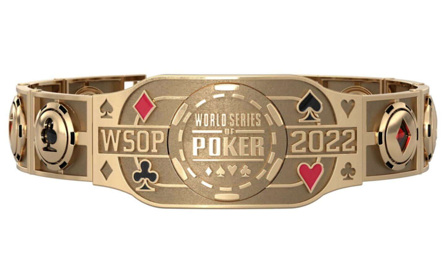
The design is, it has to be said, stunning. It’s chunkier than last year’s offering, with the suits of spades, diamonds, hearts and clubs all retaining their incorporation in the bracelet. With the year of 2022 very prominent, it looks like the kind of bracelet to kick off a new era, which of course, it is doing, as the World Series of Poker moves to Bally’s and Paris this year in Las Vegas. Starting on May 31st, it’s sure to be an incredible event series, and the world’s most popular tournaments are likely to be as well populated as ever.
How does this year’s bracelet compare to last year? Well, the bracelet of just seven months ago (the WSOP having taken place in Autumn 2021 rather than the traditional summer) was certainly slimmer as you can see below, but then we’ve all put on a few pounds in the last 12 months, right?
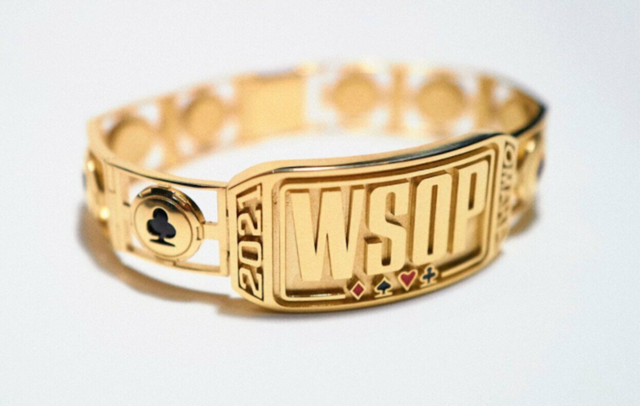
With the year incorporated to the side (and side-on) of the year, last year felt like a statement that the World Series was back. This year, it’s all about growth and this shows in the design.
Taking it Back Ten Years
The question is, how do the bracelets of today and a few months ago compare to those of the past? In the past decade, there have been many iconic designs, with the 2017 iteration among them.
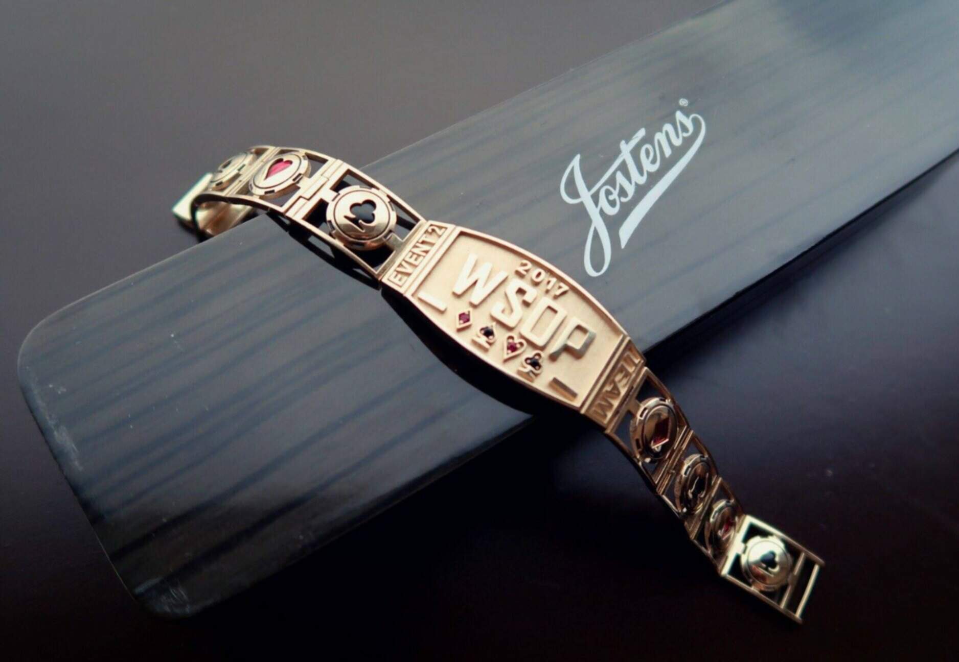
Small, discreet, with the suits over-represented on both the strap and face of the design, it was, nonetheless, a classy piece of jewellery and was certainly lighter to wear than this year’s version, which for some might give them cause to work on their lower arm muscle strength.
Five years ago, the design might have been slim-fit, but ten years ago in 2012, it was anything but.
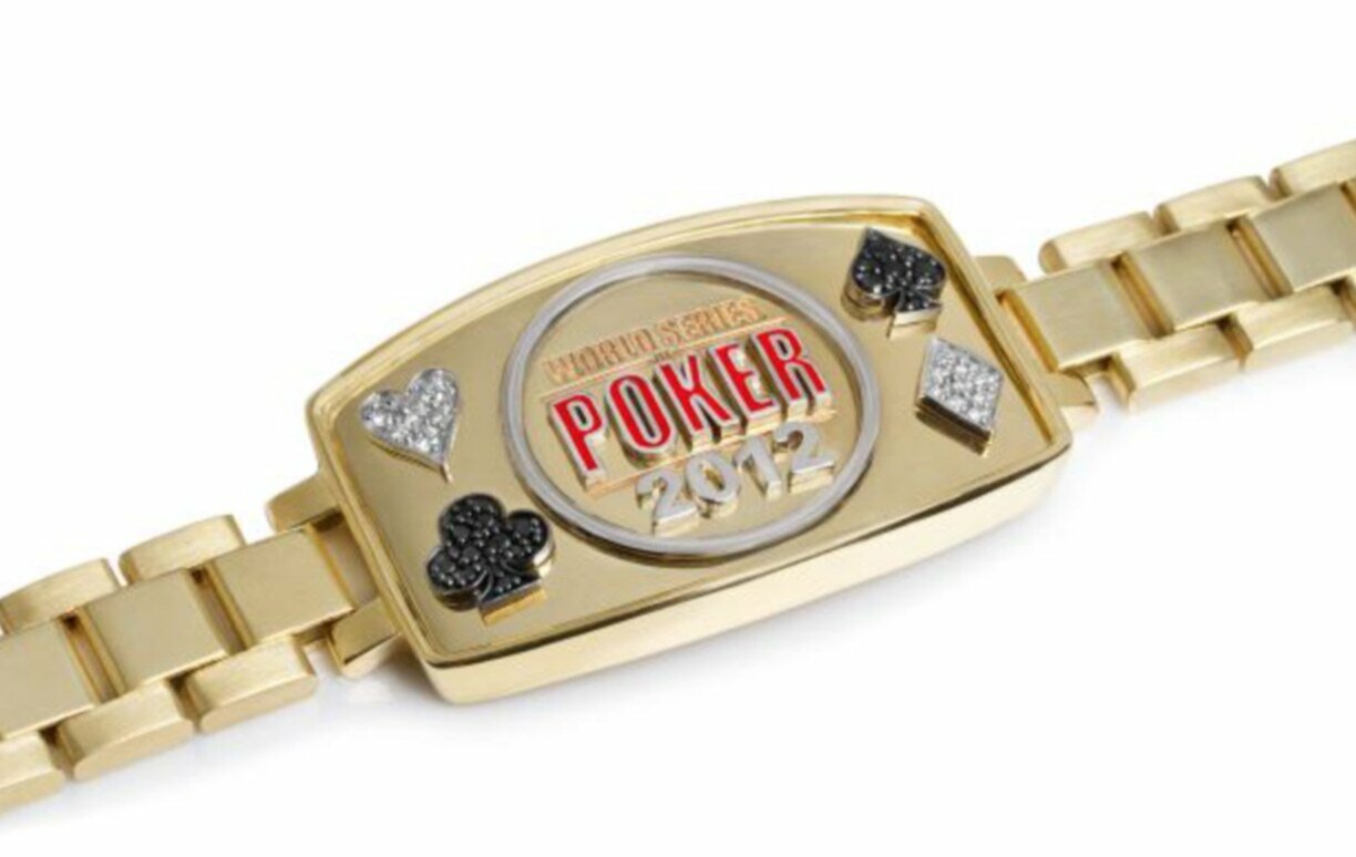
The strap could have been attached to any wrist-wear you can think of and might feasibly have been a lot easier to replace should you ever have damaged a 2012 bracelet. But the face was chunky and incorporated the full spelling of the legend ‘World Series of Poker’ rather than the common ‘WSOP’ abbreviation. With the hearts and diamonds both represented by clear jewels rather than red, it looks a little out of touch to today’s market, but we can see the appeal, with the ‘Poker’ wording colored red instead.
Old Gold Now Out of Date?
Going back a lot further, the WSOP bracelet of 15 years ago was a different beast entirely. The strap is almost plain but has a squared-off shape to each link on the chain, while the face is covered in diamonds, and we’re not just talking for the suit. In fact, each suit is weirdly represented not only by the shape, but by circles that lay in the center of each symbol too.
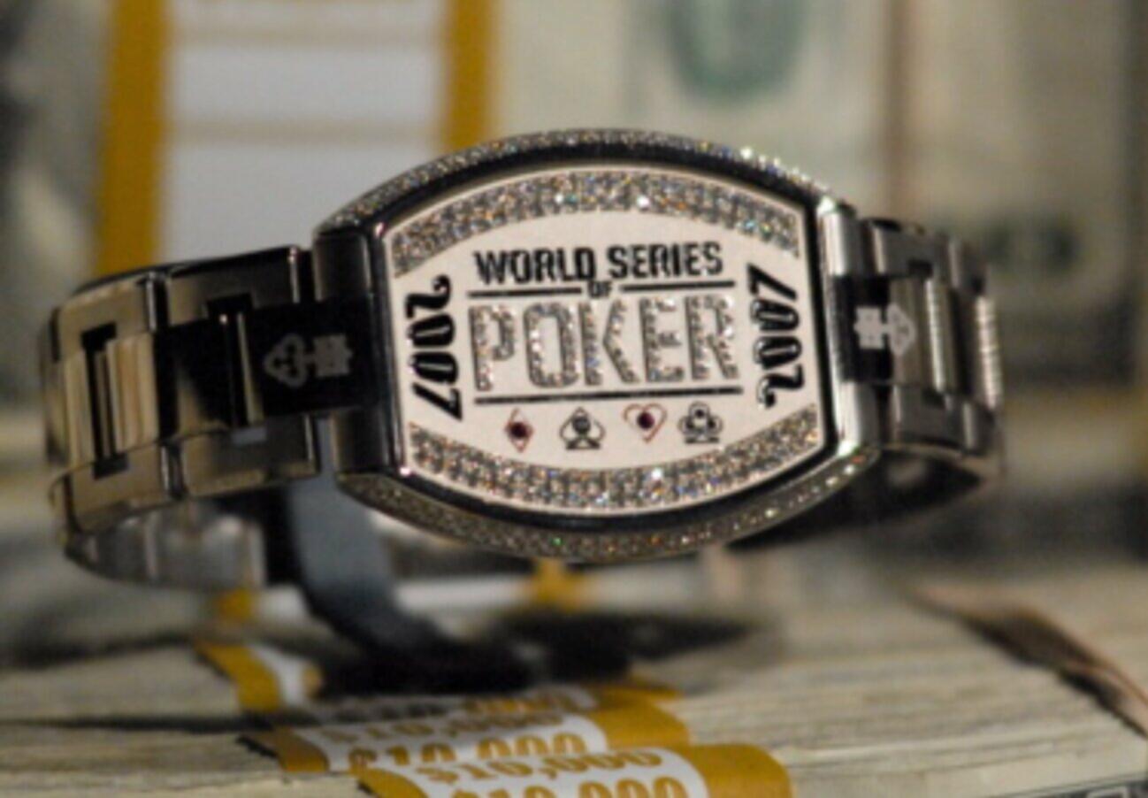
The 2007 bracelet is an oddity that perhaps no longer belongs on the wrist of any high achiever. Just two years earlier, however, the 2005 version was something else entirely. With a braided style strap of what looks like rolled gold, the face was black, with ‘World Series of Poker’ emblazoned on it in gold writing. The suits are on the face in clear jewels, neither of the black or red suits represented by their actual colors.

When it comes to designing anything new, the remit is simple; learn from the mistakes of the past while inspiring the consumers of the now. We may look back on the 2022 WSOP bracelet as an object or ridicule but as the top professional player Maria Ho said in response to the publication of it this week, “WANT.”
Thousands of poker players can’t wait to battle for glory and claim one for themselves.


